Monday, 28 November 2011

Linking Texts: Film Marketing and Synergy

All three products created as part of the A2 course must link together effectively. All three products (the Film Trailer, Poster and Magazine Front Cover) need to be related and create 'synergy'. Other forms of Synergy may include novelisations, OST's (Soundtracks), websites, tie-in games, and if it is for a children's film, figurines and models, as well as other memorabillia. Film promotions may also include 'viral marketing', using social media and other techniques to create brand awareness of products such as films.

Examples of this can be found for 'The Simpsons Movie' where '7-11' stores were changed into Resident stores 'Kwik-E-Mart's' and users could 'Simpsonize' themselves online, creating an avatar of themselves (or not) if they were part of the Simpsons. The marketers also held a competition between various 'Springfields' the fictional home of the Simpsons, to hold the premiere. This enabled Fox to keep the film in people's minds, and by having interactive elements to the campaign made the film more of an experience.

The Dark Knight held several viral events, all of which were later posted on a website, with mocked up Gotham newspapers. http://whysoserious.com/ These include, Harvey Dent campaign posters, a rollercoaster at Six Flags, a scavenger hunt at 'Comic-Con' and the reveal of the Joker, where fans emails revealed pixels. The prologue was shown before 'I Am Legend' in IMAX theatres. A similar campaign has started on the sequel 'The Dark Knight Rises' where tweeting #TheFireRises reveals the first image of antagonist Bane. The prologue for this film is scheduled to be released in IMAX before showings of 'Mission Impossible: Ghost Protocol. A manuscript from part of the prologue of the Dark Knight Rises was leaked to film website EMPIRE and technology site Wired.com, with parts cut out, making it look more official and secretive. These elements for both the Dark Knight and its sequel, allow fan's to create a 'hype' surrounding the film.


One of the most extensive examples of synergy in the last few years corresponds to the release of 'Scott Pilgrim Vs the World'. In the months before release there was:
  • The final volume of the source material, Scott Pilgrim's Finest Hour was released by Oni Press.
  • All 6 volumes of the graphic novel were released as digital versions through an iTunes app, costing slightly less and featuring bonus' for completing riddles (tap the screen corresponding to the clue). The film itself is based upon all 6 graphic novels, but uses the second volumes title.
  • 3 soundtracks were released:
    Two scores and an 'Original Motion Picture Soundtrack' which features songs from within the film, many inspiring Bryan Lee O'Malley when writing the graphic novel (Plumtree's Scott Pilgrim for instance) and those sung by Pilgrims band 'Sex Bob-Omb', written by Beck, and one of their rival bands, Crash and the Boys, written by Broken Social Scene. This album also features 8-bit versions of the 'Sex Bob-Omb' song Threshold and Beck singing some of the songs, rather than Sex Bob-Omb. A deluxe version of the album features more Sex Bob-Omb tracks sung by Beck and if downloaded online a video copy of 'The Clash At Demonhead' singing 'Black Sheep' (the album features the original Metric version). Soundtracks are often a popular piece of merchandising and many films will either have an Orchestral score or an original soundtrack, which shows the importance music has to the film
  • A downloadable game by Ubisoft, released on the Playstation Network and later, the X-Box Live Arcade. It is played in the style of an NES brawler (the graphic novel has several hints at retro video games), and features many easter eggs for fans of the comic and the film (The '1-Up' is used in the film and the game, and resembles the comic version of Scott). The game, much like the film, received a positive response and has a 77 on 'Metacritic', a website which rounds up review scores to produce an average. Many reviewers praised the retro feel and called it 'the best film tie in for some time'. When released on DVD and Blu-Ray, an add-on pack was released, which allowed gamers to get more use out of the game. While many video-game adaptations of films add in new villains or events, this is faithful to the original source material and so is similar to the author's original vision.
  • T-shirts, either inspired by what is worn by characters within the film or by illustrations in the graphic novel.
  • An animation produced by Adult Swim, which is the prologue found in the second volume of the graphic novel, and features the voices of the lead actors. This also introduced a 'new' character who isn't in the film, although it could be argued that dropping subplots was a good thing for this film. It also gave the audience who hadn't read the graphic novels more background into Scott's life before the film, which is vaguely touched upon.
  • An EMPIRE magazine cover, which had exclusive behind the scenes access. The magazine later gave the film 5*'s. The cover is covered in more depth in an earlier blog post.
  • Merchandise including key rings, figurines and bags.
  • Around the home release, a box-set of Edgar Wright films was released on DVD and Blu-Ray, including Shaun of the Dead, Hot Fuzz and Scott Pilgrim. Many of the extra's on the three are quite similar, from a 'trivia track' to 'edited TV scenes' where the swearing is replaced by less offensive words. Shaun of the Dead's 'Funky Pete' version has since become a viral video.

Sunday, 27 November 2011

Film Trailer Research

The main product within my A2 coursework is a trailer, and so researching the conventions of trailers is something that I must do early on in the planning stages. I looked at several different film trailers for this research task. There are two main types of trailer: teaser and theatrical, of different lengths and which show different amounts of film. Teasers are shown during the films production in order to create awareness of the film, while Theatrical trailers are shown a couple months pre-release, where the film has been completed. A third trailer type is a 'TV Spot' which is normally around 30 seconds and shown around the time of the films theatrical run.

Firstly V For Vendetta, a dystopian Sci-Fi based on Alan Moore's graphic novel of the same name. It opens with flashes of images, mainly Natalie Portman's character Evie being captured and interrogated. After the brief conversation, it cuts to the studio logos before showing the dystopian society, where we get a narration by V. We see title graphics 'An uncompromising vision of the future' followed by 'from the directors of "The Matrix trilogy"'. We see acts of rebellion, and then the V symbol, while the title character says the famous rhyme 'remember, remember the fifth of November'.

From the opening shots of Evie being interrogated by an unseen man in the shadows, with a voice-over showing some of her 'crimes' we can see this isn't going to be an action film, and the Dystopia is akin to 1984. It also sets up the enigma of V's identity, as we only see a quick flash of him to begin with, and so this creates an air of mystery about him. Much of the shots hide his mask in the shadows (we never learn of his true identity). Once we see V fully however, the quick cuts featuring hand to hand combat and explosions show that as well as ideas and subtext, the film will also contain a lot of action. This will mean viewers who may not like a plot heavy film (for instance the Transformers series) would go and see this.
It also gives some background into the events that took place, with the bio-weaponry scene, and one image in particular is almost identical to one found in the film version of 1984, where the leader of the new UK is talking to thousands of people on TV, which is similar to the Big Brother speeches. This means that the films themes and tone should be instantly recognisable, as does the familiar London setting, which, if this is a UK trailer, means brings the ideals closer to home. Natalie Portman is selling this film, as she is the only actress named, and features prominently. This may be because the identity of V is a secret within the film, and so is in keeping with the character. The slow motion knives intercut between action shots at the end illustrate that it will be similar to the Wachowski's previous film the Matrix (mentioned as a title card) and V's monologue emphasises the mix between action and subtext. The fans of the graphic novel would see this, as well as those who like Thriller films, or even the Matrix films.

Another trailer I looked at was The Girl With The Dragon Tattoo. There are two distinct trailers for this, the first is a teaser, which features a version of Led Zeppelin's 'Immigrant Song' over a montage of images. The theatrical trailer, gives more of the story, and introduces the protagonists, Lisbeth and Mikael, as well as the plot, where Mikael has to write find a girls killer.
By using quick cut images which fans of the book will recognise, as well as key characters, it means that they will see similarities with the source text. The style of the lettering and the fact it was marketed as a 'feel bad' movie gives us an idea that the film is very serious in tone and that Lisbeth is more of an anti-hero. The version of 'Immigrant Song' is used because of Lisbeth's character, especially her portrayal in this version. The lack of dialogue but mention of source material may intrigue those who have yet to read the book. As well as this, Daniel Craig is featured extensively, possibly to entice Bond fan's to watch, although the themes are more like some of his art-house work. Both this and the full theatrical trailer give plot details, although this works as showing it is an adaptation of the books, rather than an original story, so giving away certain plot details (but not the main villain) works to it's advantage in this way. The original Swedish versions are considered one of the most popular foreign language films because of it's connection with the books, and so these trailers show that this version is like the source text but different from the original film adaptation. Because it has source material, the audience will mainly consist of fans of the original book but also of people who have not read the books but know how acclaimed they are.

Donnie Darko is a cult Sci-Fi film, for which a trailer was created for the Directors Cut release. After some title cards and a tagline, a mystery voice says wake up, to which we see an eye opening, followed by some symbols. The rest of the trailer is a montage of images from the film, with actors credits. The director credit appears over a shot of Donnie, before flashing up the film title, where we cut to a shot of 'Frank' and 'Are You Ready?'
By doing this, it creates intrigue, as not many of the actors were well known at this point, and the biggest name would have been Patrick Swayze, and so the audience would go to see in order to understand the trailer. However, the plot can be seen as confusing, which may put potential audiences off, especially as it is an original rather than adapted story. However, not giving away too much of the trailer works for thriller films like this, especially as this film is not considered a blockbuster, and so by showing that it is an 'Indie' film with some big plot ideas be attract some audiences

The Woman in Black is an upcoming Horror by Hammer Films. The trailer consists of a wide shot of Arthur Kipps standing at a train station, followed by the studio logos,. We then see a woman telling Kipps not to go to Eel Marsh House, before clips of him travelling and arriving there. A man talks about 'opening the door to superstition' where it cuts to Kipps opening the front door, where the three monkeys 'Hear No Evil, See No Evil, Speak No Evil' are seen on a mantle. We then see Kipps in a Victorian childs room, looking at some photos, and seeing the effects of 'the woman'. Text appears on a misty window 'The Door has Opened', before seeing a montage of clips. The point of this 'teaser' is to build tension for the audience and to create awareness of the film. It would attract horror fans, particularly those of the original Hammer company, as well as those who have seen the successful West End Show, possibly to see the similarities. Daniel Radcliffe is used throughout as a marketing tool, as he is a recognisable face in British cinema, having played Harry Potter for 8 films. This is his first major role outside the franchise, and so people would want to see his acting credentials in a different role.

Sunday, 20 November 2011

Film Poster Research

One of my Ancillary products is a Film poster and so for part of the research it makes sense to write about a variety of ready made film posters.

The V For Vendetta poster is set out as a propaganda poster, which fits into the dystopian warlike state of which it is set. The two main characters are shown, as are the words ‘Freedom! Forever!’. Multiple images of V are reminiscent of the final set piece, while the silhouette of the Houses of Parliament is also significant plot wise. The director’s previous work is mentioned. The iconic mask is also seen but not completely.
This shows to the viewer that the film is dystopian and reminiscent of Orwell's 1984. As well as this, it conveys a serious tone, meaning the film is more likely going to be a thriller or drama with subtext.


This is the original poster for Star Wars. It features Luke and Leia posing on the rocks of Tatooine (due to the shelters and desert environment seen in the background) while in space there are X Wings and the Death Star, which gives an indication of the films genre.
We also have C3PO and R2-D2 near Luke and Leia, showing that they are also protagonists, while Vader’s helmet is in the sky by the Death Star giving him the appearance of the main villain.


All these elements convey a typical Sci-Fi poster, while the hero and heroine shows the film isn't a typical 'Damsel In Distress' adventure.


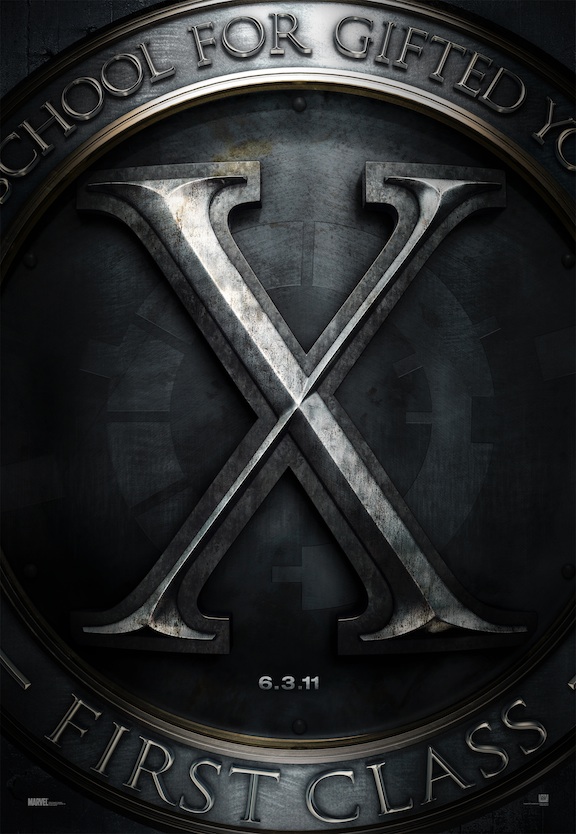
This is an example of a teaser poster. This example for ‘X-Men: First Class’ only features a date and a logo for ‘Xavier’s School for the gifted and talented’ on it. The title at the bottom gives us a clue as to what era the film takes place in the X-Men canon.

While it doesn't show any characters or locations, it means that people, especially fans will start talking about the film, and raise awareness.


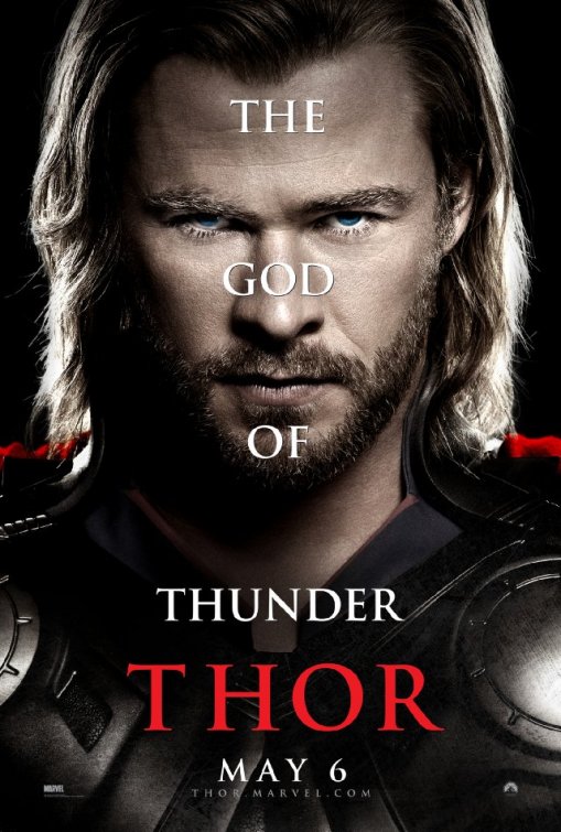
This is a character poster for Thor, featuring a close-up of Thor’s face. There is overlaying text saying that he is the God Of Thunder, whereas other character posters will talk about the nature of the other characters. A date is given as is the title, and we see part of the costume, which is significant given that it is an adaption of a Marvel comic (the MARVEL logo is seen at the bottom). This is the only indication we get that it is a superhero film. The costume has a cape which gives the impression of a superhero or royalty (he is technically both) and the armour makes us think of an impending war.


This is the character poster for Sherlock Holmes: A Game Of Shadows, featuring Robert Downey Jr as the main character and Jared Harris in the background as Moriarty, the films antagonist. Behind Holmes is a Victorian London backdrop, giving the audience of a setting. What little of Holmes costume we see shows that this is not a ‘typical’ Sherlock Holmes film. Ritchie’s remakes are more in the style of his previous films and focus more on action and spectacle, evidenced by Holmes gun being one of the posters focal points.


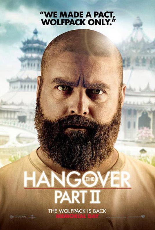
This is a character poster for the ‘Hangover Part II’ with Zach Galifianakis’s character Alan. His head is shaved, creating a difference between the original and the sequel, and adds in the idea of chaos in a new place. This is an American poster, as the release date is ‘Memorial Day’ an American holiday. Alan’s confused look plays into the idea that he is a ‘man-child’ and the ’wolfpack’ is one of his ideas.
Because the Hangover Part II posters are character posters, they are relying on the audience's knowledge of the original, and love of the characters to get them to see this film. The quote at the top helps us to identify with the specific character, and the backdrop gives us an idea of a different location.


This is the poster for Harry Potter and Deathly Hallows part 2. The ‘IT ALL ENDS’ tagline relates to this being the final film in the series . No title is given, as the film is seen as a ‘cultural phenomenon’, but we see the main characters standing outside the ruins of Hogwarts. The expressions and clothing indicates that this is going to be full of effects, a ‘wizarding war film’ as some reviewers described it.

The poster sells the film in two ways, firstly the success of the Harry Potter franchise (the use of the three main characters) and the fact it will be the final part of the series.

Sunday, 13 November 2011

Looking at Film Magazine Front Covers

Many hobbies will feature specialist magazines based upon a certain subject. The two most well-known monthly film magazines published in the UK are EMPIRE magazine (published by Bauer media) and Total Film (Published by Future Publishing). While the layouts are similar, both have distinct logo's. They will also have similar films on the cover of each issue, although this may differ depending on whether they have 'exclusives' on the cover film or another feature they wish to show off. These are more common in EMPIRE magazine, which often have 'On Set Exclusive's' and also regularly have features like the 'Top 500 movies' and 'icons of the decade' although Total Film also had the latter. This makes comparison more simple.

MAIN FILM: INCEPTION
Both Magazines featured Inception as one of their titles films. These are the covers:

The Total Film cover incorporates the film into the logo design, which may be because the EMPIRE logo is famous for it's red, while the Total Film will often change its design depending on the film, and both feature Leonardo Di Caprio. However, EMPIRE's photo looks posed specially for the magazine, while Total Films is photoshopped out of a film still. Both offer other features, such as other films and features, which are both different. EMPIRE's is part one of a two part piece on Alfred Hitchcock, while Total Film has 'the 27 most mind-blowing movies ever!'. The language describing the cover films both relate to dreams and the mind, due to the subject of the film being people inputting ideas into the subconscious. By both featuring the main character, they are hoping to sell the magazine on the main actor, as he has universal appeal, and to show that the narrative is directly related to Di Caprio's character (some covers feature multiple characters from the same film). Leonardo Di Caprio had also had another similar film, Shutter Island released, and so the parallels between the two could be drawn from the clothing and stance. The clothing shows that his character is an official or a spy, in a similar character to Bond, which may be why 007 is mentioned in the subtitle.

DIFFERING COVER FILMS:
A recent issue of EMPIRE featured David Fincher's adaption of 'The Girl With the Dragon Tattoo', pictured below:
As it states on the graffiti, it is the only magazine on set. This means that Total Film's cover would feature a different film. The cover also features other parts to the magazine, such as a Steven Spielberg interview and credits other actors rather than directly referencing the films, possibly because more people know who (Justin) Timberlake is than what his new film (In Time) is called. These names, especially Speilberg's, will try to sell the film to those who don't want to read about the Girl With The Dragon Tattoo. In fact, the other films advertised are not even of the same genre (Superhero, Action, even Sports), and so these films cater to fans of those audiences The cover photo sets the films tone, and the characters are instantly recognisable to those who have read Stieg Larrson's novel. Salander is the 'icon' mentioned in the cover text, while Daniel Craig brings star power to the cover, and the film (before this, Rooney Mara's biggest film was 'The Social Network, also directed by Fincher, although she only had a small role). This guarantee's both fans of the books, who wish to see Salander's look in the series, and fans of Daniel Craig's films, such as Bond, will buy the magazine. As well as this, the title is quite large, and by the time this was released the series had got quite a lot of media attention, and so this could also get people to buy the issue.
Meanwhile Total Film chose to run with:

The Girl With the Dragon Tattoo is featured, but they chose to have a feature (a preview of films being made) rather than focus on one specific film. The lighting makes the main three images look photo-shopped rather than posed, however, they used stills for the other films. Unlike EMPIRE, it is only that feature that is advertised, although it contains ten films according to the cover. By focussing on a franchise (Mission Impossible), a 'masculine' film (Immortals), and an adaptation of a popular series of novels (the Hunger Games) it can attract all types of audiences, like EMPIRE mentioning other film genres on it's Dragon Tattoo cover. Unusually, the barcode/publisher logo is in the bottom centre rather than on either side, although this can be explained by the banner location, rather than trying to get away from magazine conventions. The word coolest makes the average reader want to find out what these films are, as many people will want to find out what has made the list. This type of feature normally drives up sales, for this reason. The background lighting draws attention particularly to the character from Immortals, which may not be the most well known of the three main films.

Sunday, 30 October 2011

Trailer Comparison PowerPoint

This is a PowerPoint Presentation I have done based upon the similarities and differences between teaser and theatrical trailers. The trailers I have compared are 'Super 8' and 'The Dark Knight', both teaser and theatrical trailers.

Sunday, 2 October 2011

Practical Text Write-Up

Another text we had to do was create a trailer based upon a fairy tale, because trailers were the medium for our main piece. Our chosen one was 'Red Riding Hood'. We had to use careful camera shots in order to create the feeling of being in a forest setting, as well as changing the lighting and tone, to make the trailer seem as close to the source material as possible, without spoiling the narrative, in the same way as real trailers. As well as this we had to add in background music which we believed would add to the tension of the trailer.
Although some of the trailer can be slow paced, we managed to set up the plot without giving too much away, such as the end resolution, while keeping the atmosphere and tension of the original story.
By doing this exercise it shows the elements needed to create an effective trailer. The trailer and footage could be edited in different ways to create a different trailer, but keeping the atmosphere. One way of doing this could be a succession of quick cuts (as seen in 'The Girl With The Dragon Tattoo' teaser trailer) or by using voice-over.
The trailer focussed on the beginning and middle of the story, starting with 'Red Riding Hood' being given a basket of food, and then cutting between shots of 'Red Riding Hood' and the wolf. Cross cutting between the two in the same locations and the use of music created tension, and made the character roles clear to the audience. Because it was a trailer for a relatively short story, the trailer wasn't much longer than 30 seconds long, but it did feature many typical trailer conventions, and introduced the story with few spoilers. Doing this task allowed me to get a feel for making my own original trailer, and showed me things like how to use Final Cut Pro effectively, and what to include/not include in order to make the trailer effective (get people watching the actual film).

Unfortunately we were unable to put a copy of this trailer online, as the file could not be found at a later date.

Linked Texts Write-up

Because the A2 coursework involves us creating three parts for a promotional package, they must be in some way linked together. To show how this could be done, we were given, in small groups, one of three tasks and had to create linked texts, i.e. a poster and a storyboarded trailer. Our brief was a Football/Sports magazine show.
We started off with finding the title, and decided upon GOAL!, which is used throughout sport, particularly football. After this we had to decide who would appeal most as hosts on the show, as we knew that for magazine shows like this, it's often the presenters that make or break it. We ended up going with Chris Kamara and Robbie Savage, who are well known in the sporting world. We then designed the Poster and the storyboard, which both heavily featured the pair.
The poster was the two of them standing on a pitch in suits, while the trailer showed them getting ready to start a football match, but instead of putting on a football kit, they are wearing the same suits as the poster. The other matching features of the two included the title font, the tagline (the new football show), and other information, such as the channel (Sky Sports 1 HD) and time (Saturdays at 7pm). Both had a professional tone to it (suits), but the way the hosts were standing/the action in the trailer showed that it was meant to be more informal and friendly. By linking the text in this way, it created a consistency which wouldn't confuse the target audience.
The target audience would be males between 25 and 35 who would prefer the informal style seen on other Sports shows like Match of The Day. As well as this, men are often stereotyped as liking sports, particularly football, and so would need to appeal to them. Robbie Savage and Chris Kamara are both seen as laid back or comical characters (there are several YouTube videos of Chris Kamara's mistakes and on-air blunders) and so would keep with the informal style without going to over-the-top, which it could be argued happens in shows like Soccer AM, which targets a slightly younger demographic (18-24).